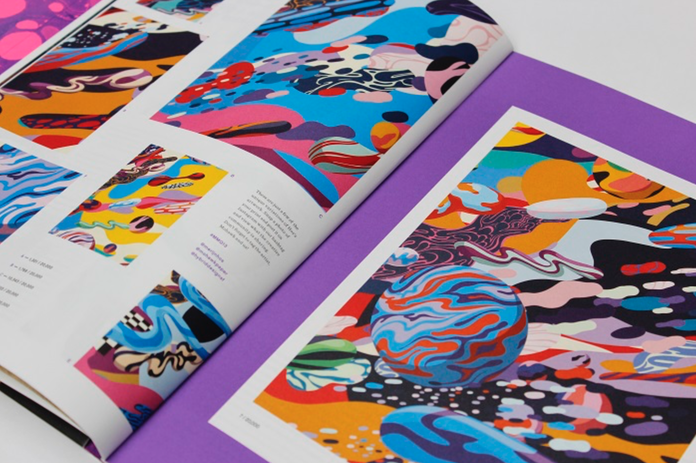
I’ve been working with the fantastic team at Hybrid Design in San Francisco to create content for Mohawk Paper‘s Maker publication for quite some time now. The writing I did for Issue No. 13 was especially interesting, because it challenged the way I think about the differences between fine art and design, blurring the line between the two.
For the issue, the design team commissioned illustrator Merijn Hos to create an art print — but it wasn’t just one image. Thanks to the way Hos constructed his illustration, a computer program that the Hybrid team used and something called variable-data printing, each edition of the Quarterly contained one unique version of 20,000 total prints. Mind blowing, right? It was kind hard to write about, too.
See more of Mohawk Maker Quarterly 13 here.


